Blog—11 MARS 2025
Smörgåsbord’s hands-on approach to creative projects: A conversation with Dylan Griffith
Smörgåsbord Studio blends bold design, craftsmanship, and storytelling to create unique, hands-on experiences that transcend traditional agency work.
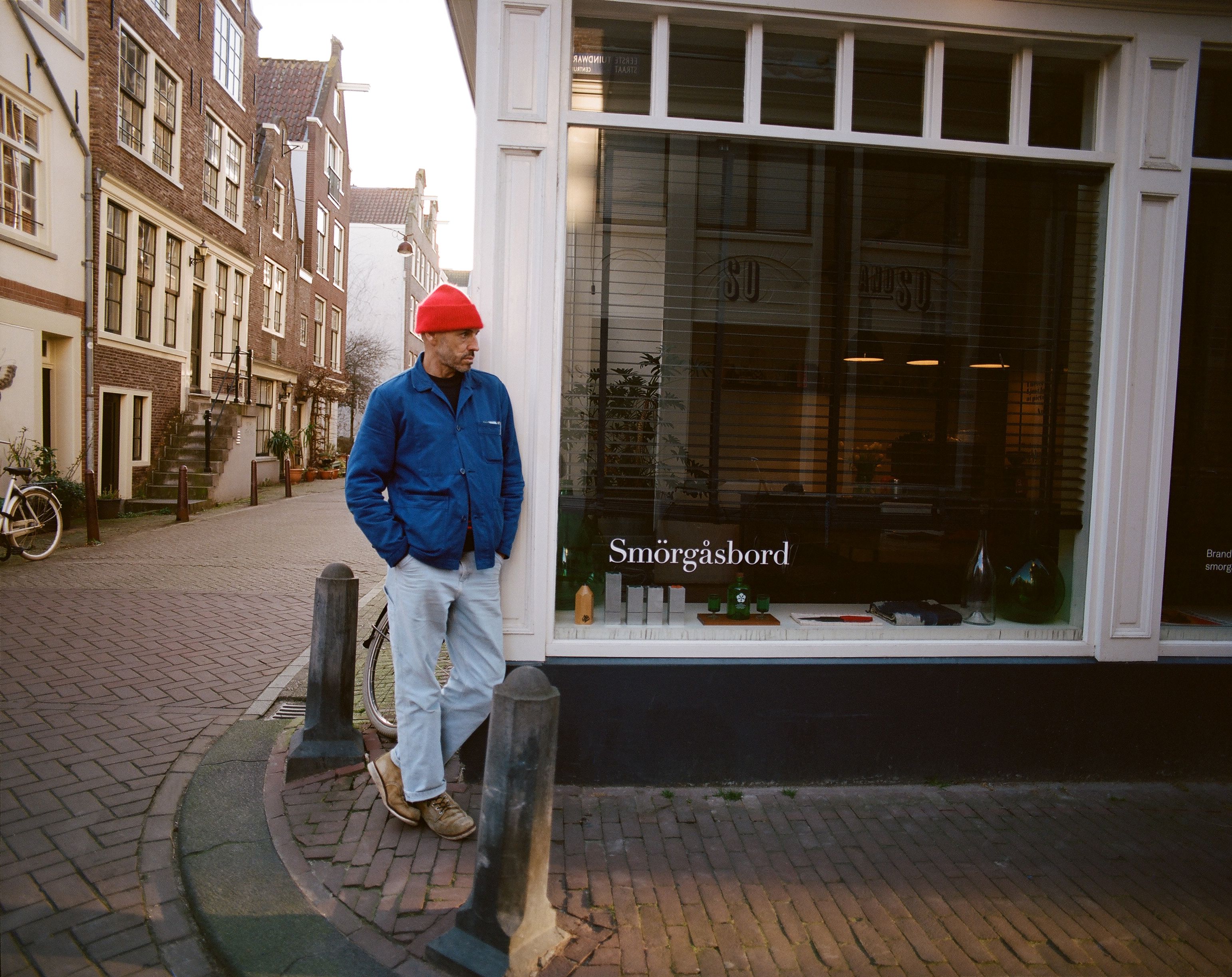
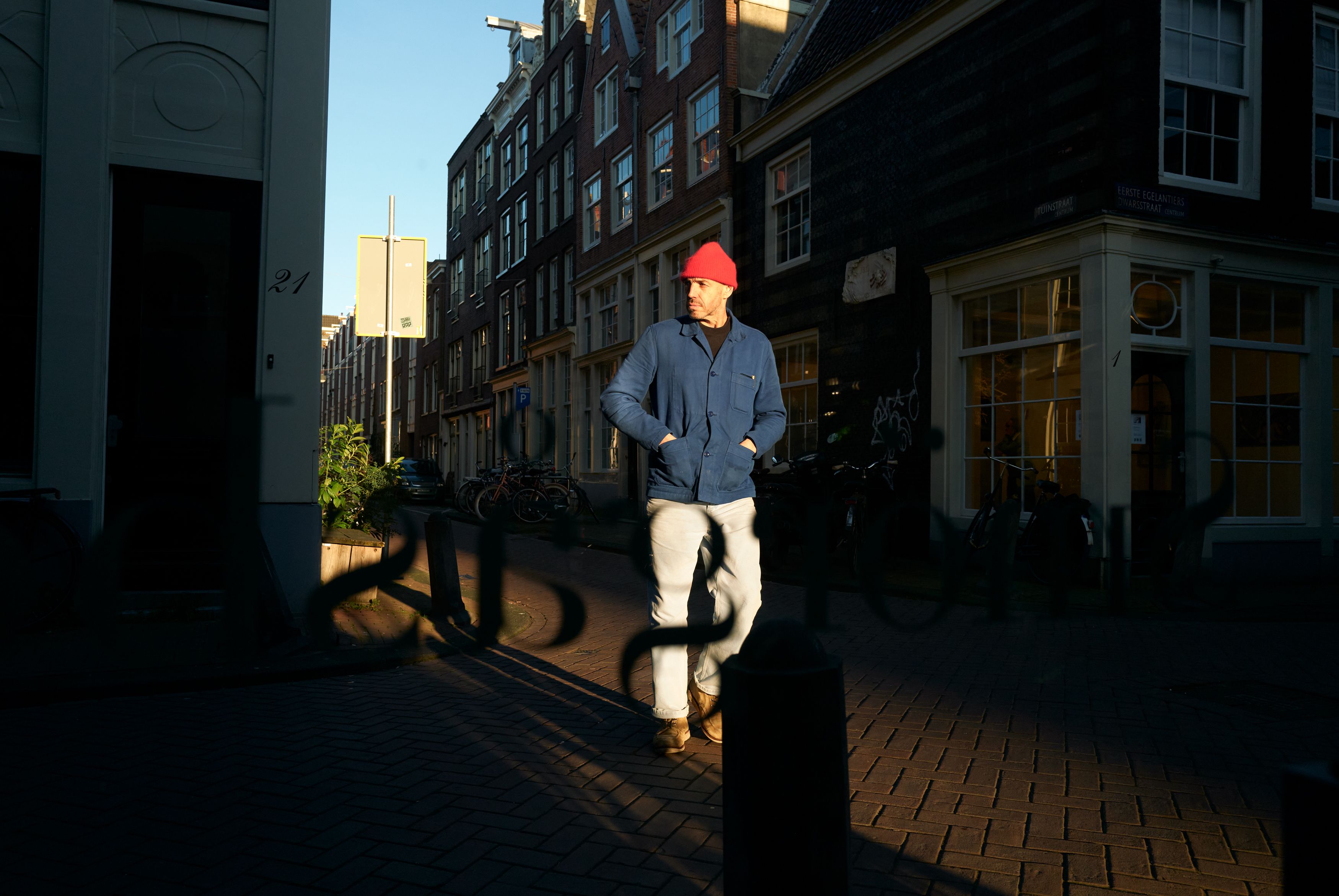
During their recent trip to Amsterdam, Michael & Fred had the chance to meet up with Dylan Griffith, co-founder and Creative Director of Smörgåsbord, a creative agency known for its hands-on and collaborative approach to design. In this article, they caught up with Dylan again to dive deeper into their creative approach and learn more about the exciting projects they've been working on, like LOT61, The Brecon, The Cambrian and Cool 'n Vintage. Let’s dive into their conversation and get a closer look at the agency’s journey and vision!
Can you tell us about Smörgåsbord’s philosophy and approach to creative projects? What sets your agency apart?
“When people think about an agency, they often picture a large organisation. While for Smörgåsbord, it’s actually ‘just’ the two of us, me and my business partner Alex. As we’re a small team, we’re definitely Swiss-army knifes; both Alex and I are hands-on and fully invested in every project. What makes us different is that instead of having a huge in-house team, we build custom teams for each project, bringing in the right people for the right projects, if so required. Amsterdam is the perfect place for this because there's no shortage of exceptional design talent here. Over the years, we’ve built a reputation for taking on challenging and exciting projects of all scales with great clients, which means we have the pick of the best people for each project. We design everything from brand identities to fonts, furniture, interiors, products and packaging. We always identify one big idea – or golden thread – which informs all brand touch points so that the work delivered feels tight, aligned and effortless. Another point of difference is that we very rarely pitch – we rather identify individuals and brands whom we respect and feel an alignment with, and once a connection is forged, clients, collaborators and friends are made. This is when we create our best work."
Where does your name come from?
”When people hear Smörgåsbord they’re usually curious! Why would two Welsh guys living in Amsterdam pick a Swedish name? But for us, it just fits perfectly. In English, ‘smorgasbord’ can be used to refer to a mix of great things, an extensive array or variety. Whether it’s vintage cars, craft beers, or quality merch. That versatility reflects how we work. We’re not tied to one discipline; we love jumping between different creative worlds. Plus, there’s something about that Scandinavian attention to detail and refinement that resonates with us. We liked the way it sounds, the way it looks, and most importantly, the creative freedom it gives us."
Your work is highly creative, but what keeps you inspired? Where do you find new ideas for your designs?
“It’s not usually in the studio, but more when we’re outdoors or on the road – exploring new cities, countries and cultures. Alex is an avid rock climber and snowboarder, whilst I'm into mountaineering, skiing and mountain biking so the outdoors is a huge source of creativity and inspiration for us. While Amsterdam itself is inspiring, the contrast of being in a new environment, surrounded by new people, is often when new ideas begin to flow. And then, of course, meeting interesting clients who have unique ways of thinking about their own businesses is incredibly inspiring as well. All of this feeds into our creative process.”
When working with clients like LOT61, The Brecon, or The Cambrian, how do you balance creativity with client needs?
“We’re lucky to work with clients who are more often than not already aligned with our creative philosophy and ambition, and are design driven themselves. This makes the relationship feel more like a collaboration than a typical client-agency dynamic. We often find ourselves working on hospitality projects, which for us, is the perfect intersection of digital and physical design. For hospitality brands like coffee shops, bars and hotels, design is usually at the core of their identity. To not place a strong design concept and aesthetic at the core of these projects would be contradictory. But it’s also not just about creating a traditional brand identity; it’s about shaping every touchpoint of the experience, which makes it even more complete.
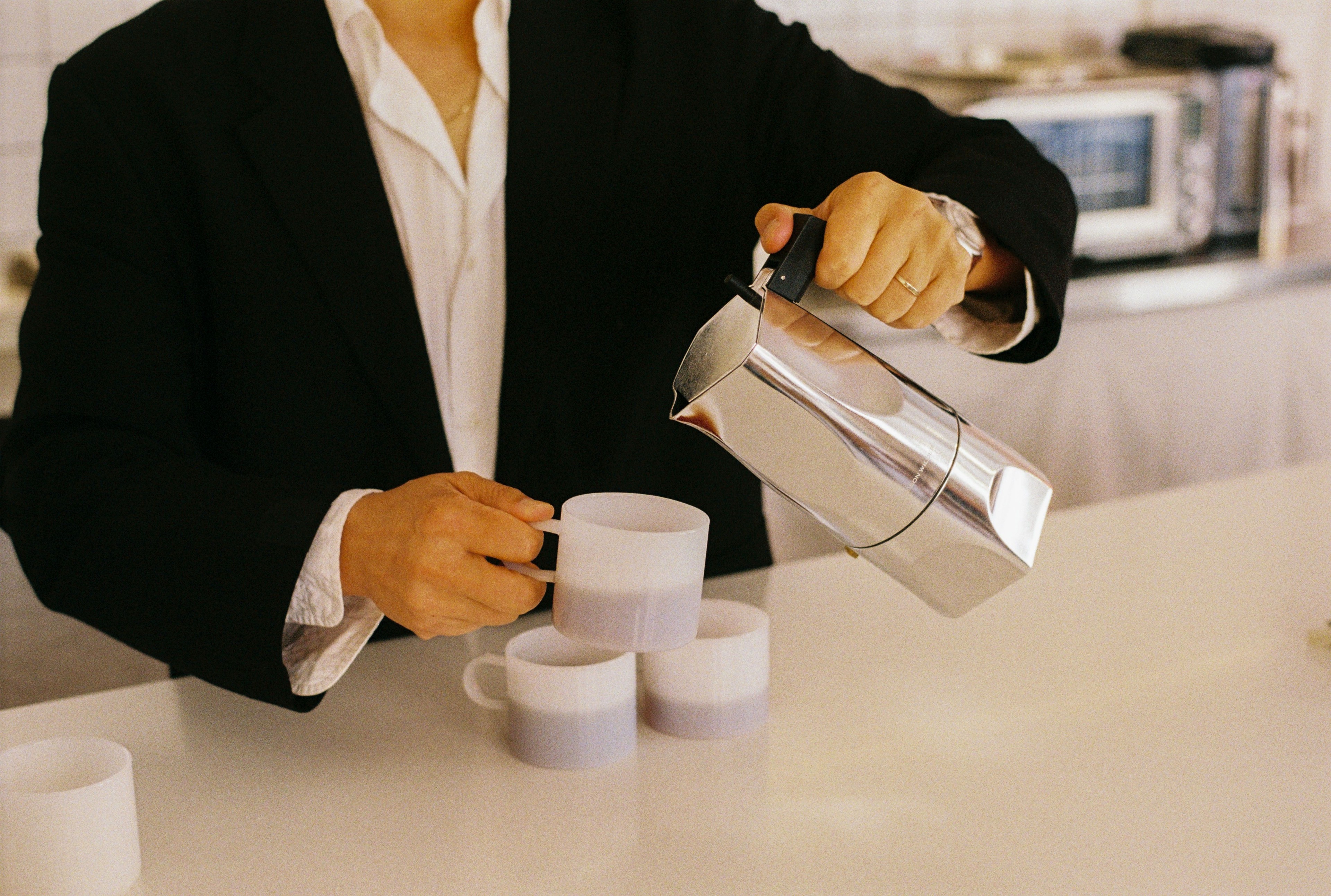
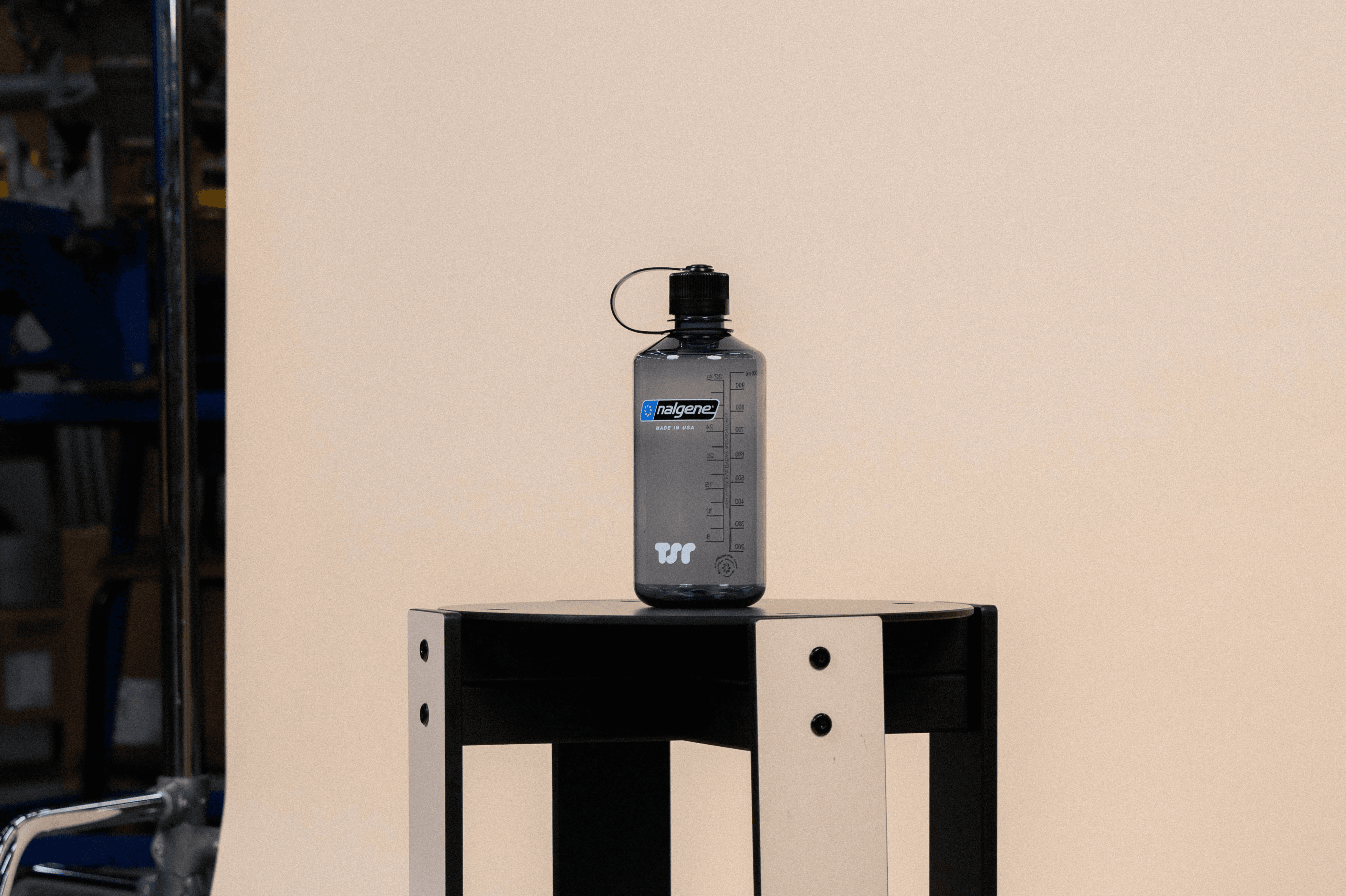
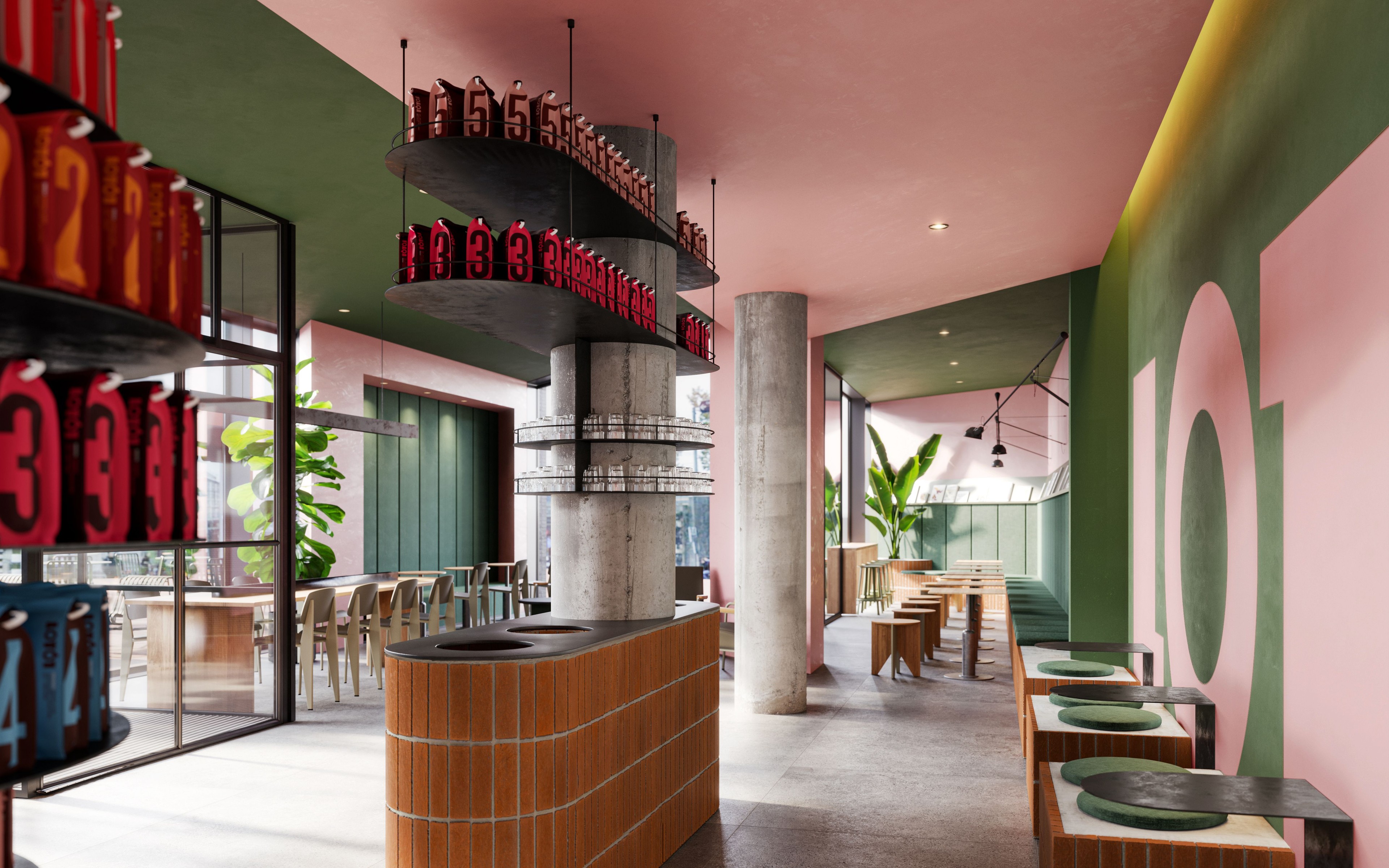
Take LOT61, for example. We started with their branding, then moved on to packaging, and eventually we were tasked with designing the interior of their new flagship café. It was about imagining what that space could look like through the LOT61 lens, down to the finest details. So we ended up designing everything from a custom wordmark to interiors, bespoke furniture, lighting, cups & saucers, and uniforms. This holistic approach is hopefully what sets us apart and keeps things exciting”
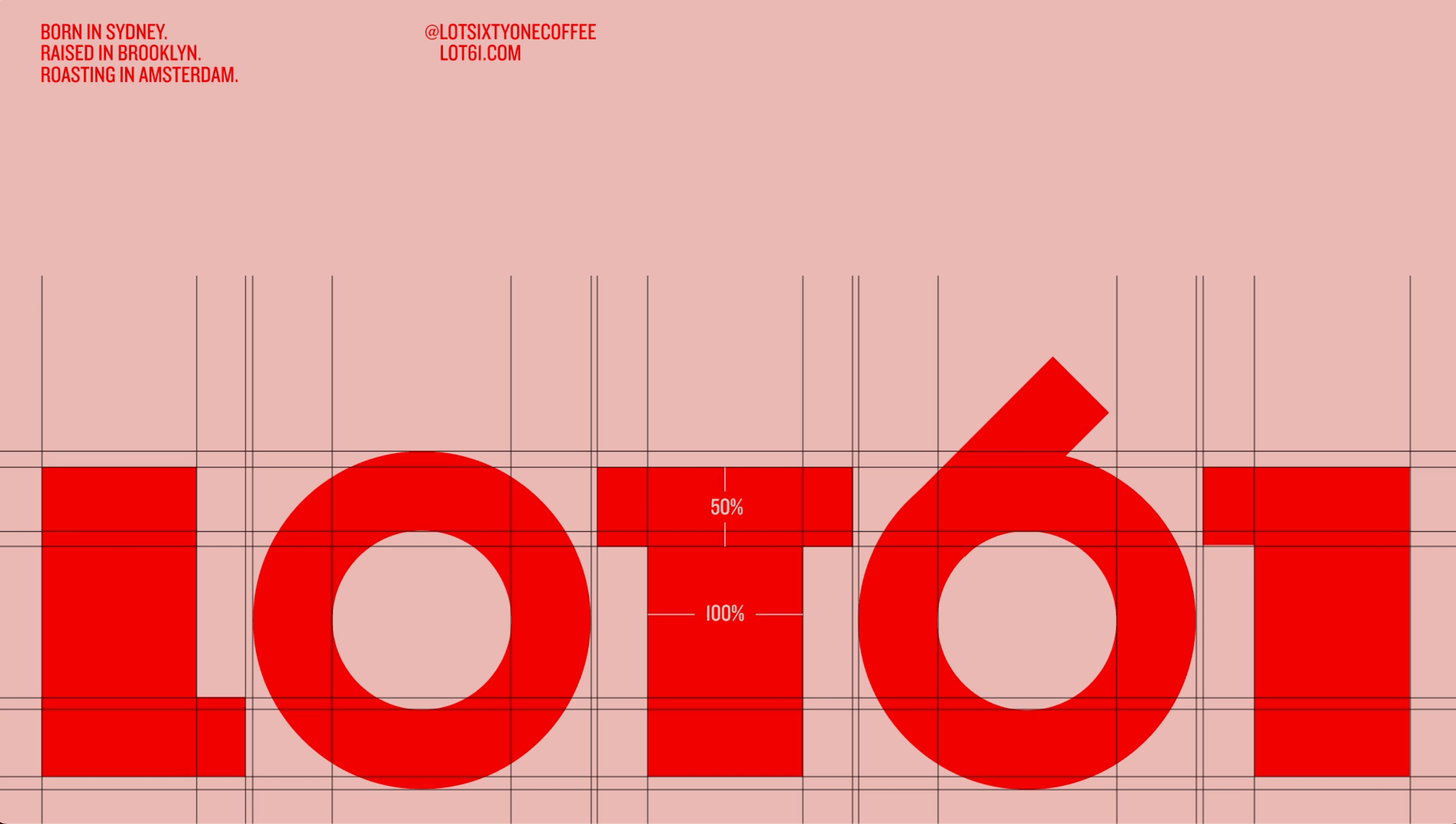
Can you tell us about the approach you took for the LOT61 brand identity?
“To craft the perfect identity for LOT61 we rigorously researched and subsequently categorised all coffee brands into four groups: minimal hipster, traditional Italian coffee hardware, the new norm (which often features distressed wood letter type), and 'mainstream'. This led us to identify where LOT61 should be positioned. More often than not we'll swim in the opposite direction (from the competition) which is what can make a brand memorable. This means that we generally only ever present one design concept. Why would we present a second or third best? This obviously comes from a place of trust, which we place great importance on.
For their brand, we coined the strap-line "Born in Sydney, raised in Brooklyn, roasting in Amsterdam" which reflected the unique first ten years of their existence. Given their current location in the Dutch capital it was really important for the client to reflect Amsterdam in the identity, so we studied the architectural fabric of the city. We struck upon the 'Amsterdam School' – an architectural style that was prevalent in the city between 1910–1930 and known for its innovative use of bricks and curvaceous, flowing forms. The Amsterdam School also inspired brilliant typography and signage that displays an inherent sense-of-place. So the School's aesthetic became a strong influence for both LOT61's brand identity as well as for our concept for the interior design, which we referred to as 'Soft Angles' – 180° terminals juxtaposed with right angles.
To really sell the vision, we took things one step further. We reached out to Stone Cycling (now rebranded as Front), an Amsterdam based company that creates bricks from recycled building materials. We pitched them an idea: what if we could blind emboss the LOT61 logo directly into a brick? They agreed to do a one-off test for us. When the brick arrived at our studio, we placed it on the client’s desk and simply let it speak for itself. That moment won them over. It was the perfect example of how digital and physical design can come together in a meaningful way, and that singular brick became a tangible expression of the entire brand concept. And with that, the vision for LOT61’s 200m² café was set in stone, literally.”
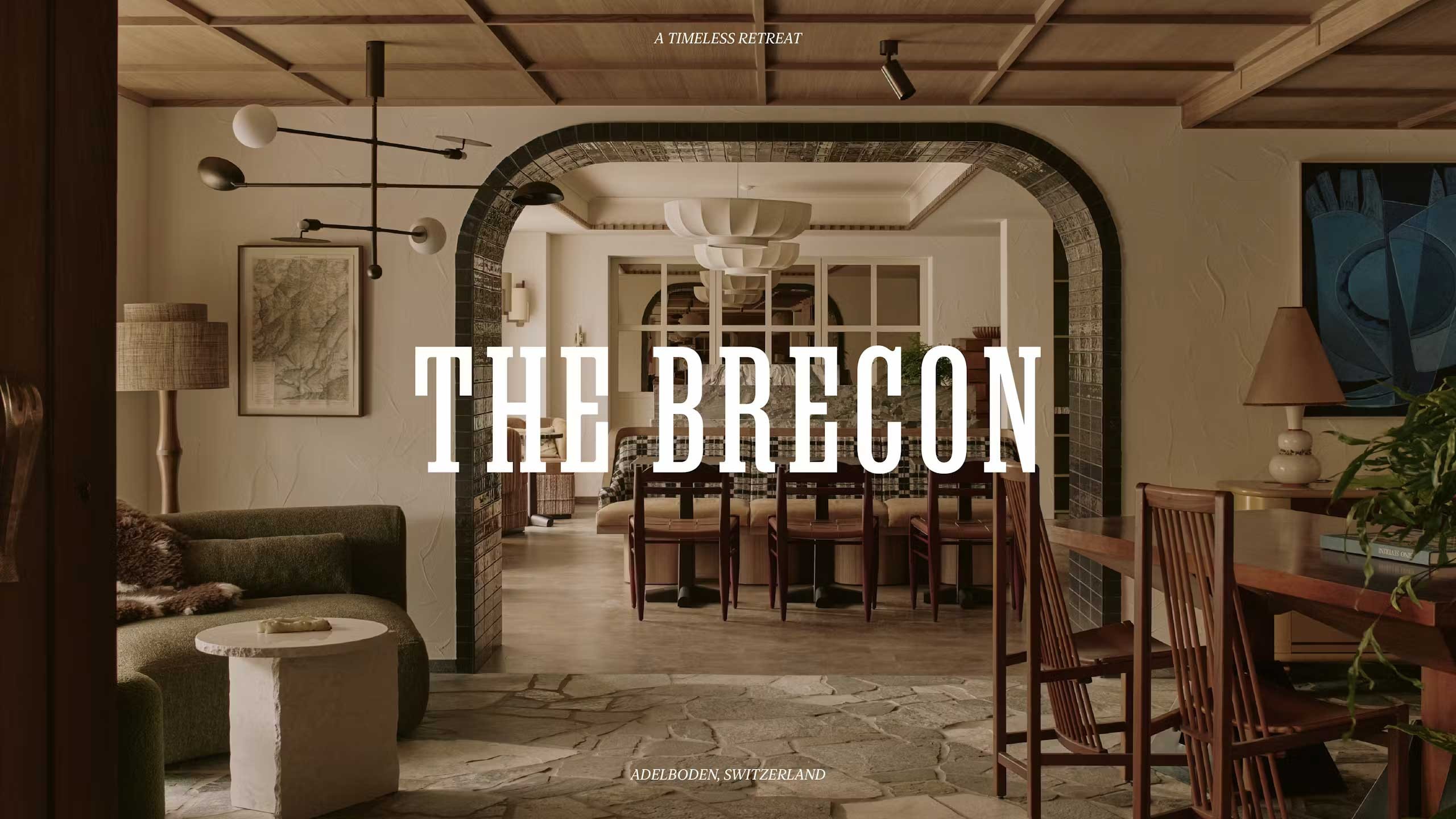
The Brecon and The Cambrian are both hotels, but they have distinct identities. How did you approach branding for each?
“The Brecon and The Cambrian are both Welsh-owned hotels in Switzerland, and while they naturally share a connection to Wales, they each needed their own unique identity which referenced their locale. One is CHF 800 a night and has 22 rooms and the other is CHF 400 a night and has 71 rooms – so the brand look and feel of each needed to communicate these price points and their respective guest experience. One could say that The Brecon is exclusive, but in a non pretentious down-to-earth and personable way, whilst The Cambrian is 'mass-clusive'.
For The Brecon we sought inspiration from the traditional wood carving techniques used in the Bernese Oberland. The 'B' marque' is based on a re-drawn letterform from the 'Respira' typeface by Sharp Type, and the logotype and display face uses 'Manuka Slab' from Klim, which is an almost identical match to the previous hotel's identity crafted in the late 60's. The result is a subtle, understated yet confident identity. We applied this graphic language to everything from food and drink menus to towels and bathrobes to carpets, curtains and uniforms.
For The Cambrian, the brand needed a louder, more dynamic approach. The core 'C' is informed by traditional Swiss paper cutting techniques – Scherenschnitte – and we offset this with Swiss type foundry Line-to's 'Le Corbusier' typeface. The Cambrian’s brand is a bit more in-your-face, whereas The Brecon is more about being discreet. Both brands, though, share strong photography, which we find essential in conveying their respective personalities.”
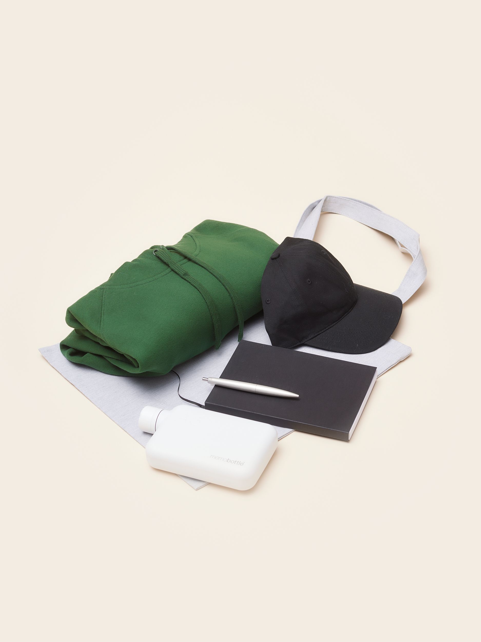
You’ve worked on a lot of merchandise for LOT61 and both hotels. Do you have a favorite item?
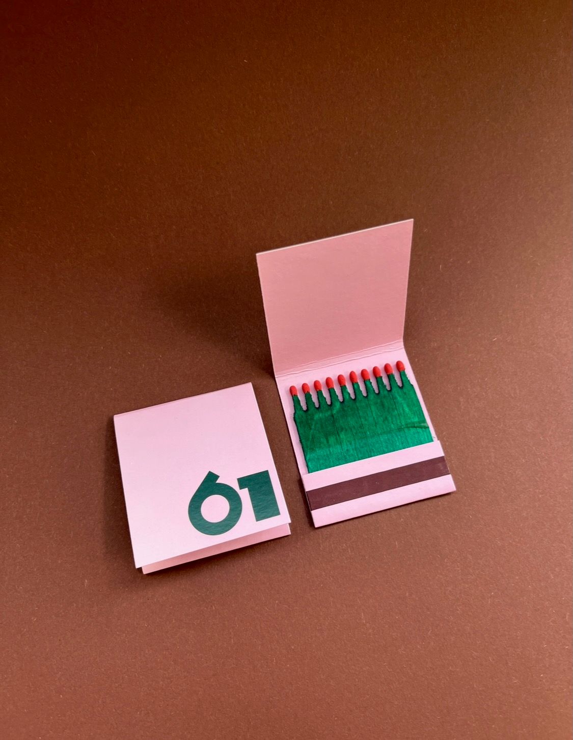
“It’s a bit of an odd one, but I really love the matchbooks we created for the hotels. They’re such a simple, utilitarian item but they’re also a keepsake for all the candle-lighters, romatics, graphic nerds, smokers and pyromaniacs amongst us. People love taking them from hotel rooms, and it’s something that feels timeless. We also produced a matchbook for LOT61 as they work so well. I also really like The Brecon tote bag, which is beautifully understated. It features a warm pinky beige colour screen printed on heavy ecru cotton and is a tote that I'd actually want to use.”
What’s next for Smörgåsbord? Are there any exciting projects on the horizon?
“We’re really excited to be working with the Portuguese brand Cool 'n Vintage, a company that specialises in Land Rover restoration and who are truly at the top of their game. It’s the kind of project that’s right up our street, where craftsmanship, heritage and design all come together.
Funny enough, we actually reached out to them about the idea of creating a typeface informed by the numerals that feature on early Land Rover speedometers two years ago but never heard back. We didn’t want to give up there so we kept refining the typeface by teaming up with Manchester's F37 type foundry. When we finally went back to Cool 'n Vintage and showed them what we’d come up with, their reaction was, ‘F***, that’s brilliant.’ And from there, everything clicked and we're now working on their entire brand experience, from brand identity and custom typography to a journal, uniforms, wayfinding and workshop super graphics. It’s a full-circle project that brings together design, craftsmanship, and a real connection to the product they’re restoring.
In addition to that, we’re continuing to look for more projects that blend the digital and physical worlds. It's early days but one such project involves us working with a master carpenter in West Wales to re-imagine and contemporise the Welsh Stick Chair – an iconic piece of furniture that has its roots in the 13th century. The more challenging the briefs, the better! It keeps us learning and evolving."
Do you have any tips for attracting your dream clients?
“I’d say keep it personal. Nobody's further than a phone call or DM away. We love working with passionate, interesting people, and that makes us passionate and interested in return. It’s a bit of a cliché but authenticity is everything. If you truly believe in what someone is doing and show real commitment to their brand, they’ll feel it. Cool 'n Vintage is a perfect example of that. We reached out because we genuinely admired their work, and that honest enthusiasm led to an incredible collaboration.”
Big thanks to Dylan for the chat and for letting us peek into Smörgåsbord’s world. Loved hearing how passion and a hands-on approach keep things exciting! Don’t hesitate to follow their work on their website and socials."