Blog—11 DÉC. 2025
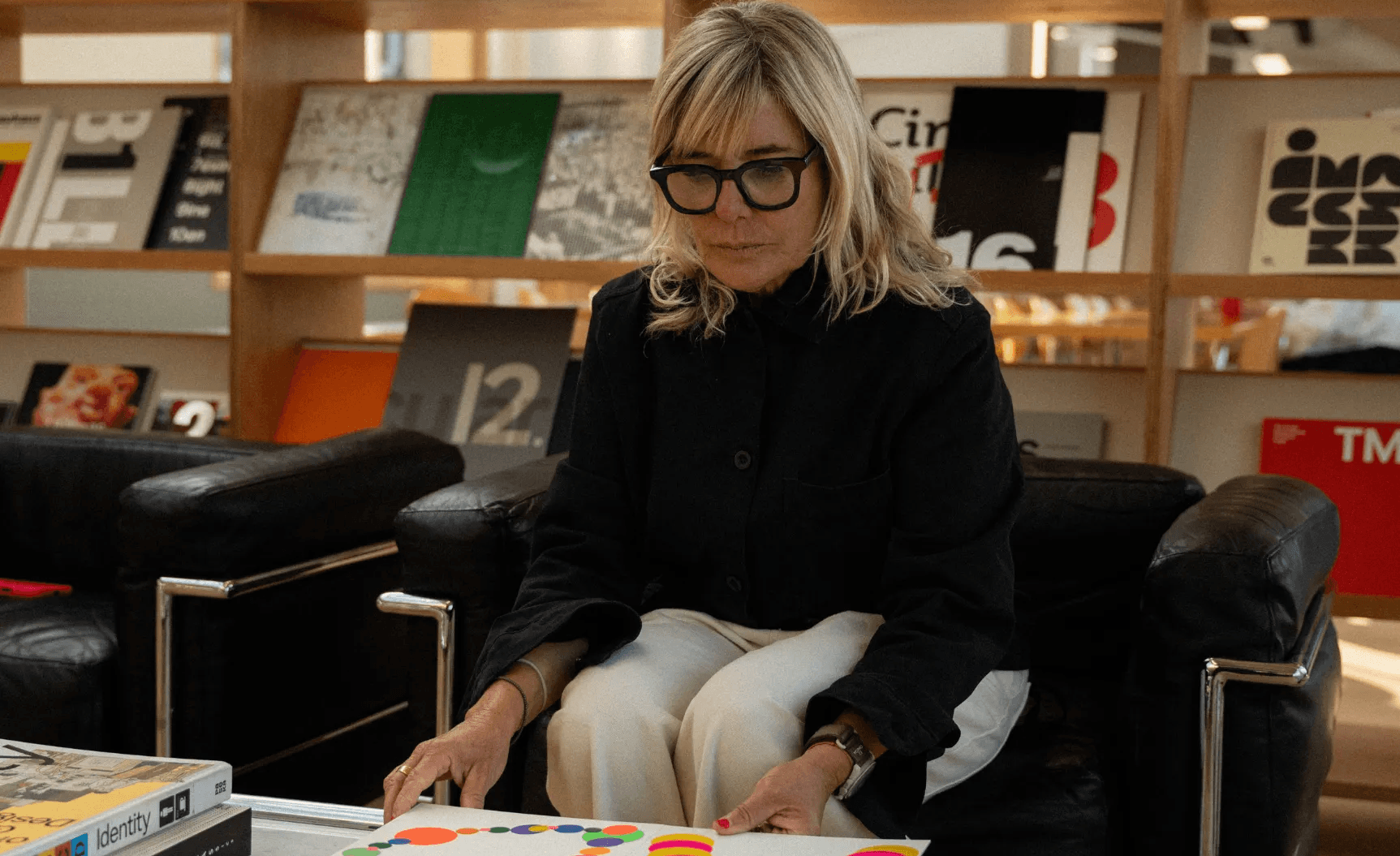
Behind the branding of Love Supreme: a conversation with Pentagram's Marina Willer
Inside Marina Willer’s creative process at Pentagram, revealing how experimentation brought Love Supreme’s visual identity to life.
Marina Willer is a Partner and Creative Director at Pentagram London, where she leads a team of designers working across branding, strategy, and graphic design.
She joined us for an inspiring conversation about her experimental approach to design: what sparks it, how it unfolds, and why pushing boundaries is so essential to be creative in her process.
We connected with Marina while creating merch for Love Supreme Projects, a London-based yoga studio rooted in mindfulness and design. She walked us through how their visual identity came to life: a process she approached through hands-on work and continuous experimentation.
In our conversation, Marina shares the influences that shaped her creative vision, how Pentagram’s unique structure encourages freedom and experimentation, and why creativity sits at the center of every project she takes on, including Love Supreme.
Can you introduce yourself and tell us what you do?
Marina explained to us that she is a Partner and Creative Director at Pentagram in London, where she runs a team of creatives. Each partner leads their own team, allowing them to work very independently, almost as if they were running their own practice, while still being part of a larger collective of designers.
“My work is mostly around branding,” she said, “but branding in a very broad sense.” For her, that includes concepts, identity systems, graphic design, and a lot of experimentation; essentially whatever a project needs. She also makes films, which remain a significant part of her creative life, and continues her personal practice as a graphic artist.
Branding, she noted, can involve many different forms of expression, which is why her role stays deeply creative and very hands-on across diverse projects.

What inspired you to work in design?
“I grew up in a very creative environment. My dad was an architect, my mum does pottery. So design and making things were always present in our home.
As a child, I was always painting, drawing, inventing things, building weird constructions with whatever objects I could get my hands on. I think creativity came before design. It came from this passion for making things. Design just became the natural direction.”
How would you describe your creative approach, and the Pentagram’s one?
“Pentagram has a lot of freedom in its model and structure. Each partner runs their team almost like their own little startup, allowing us to be very creative in what we do, and very engaged and hands-on.
My creative process is about using less conventional processes; more experimental ones that truly relate to the outcome and the needs of a particular project or client. Every project asks for something different. I always try to make the result of a process or a design quite different from one another.”
Love Supreme is a good example of that experimental approach. How did that identity begin?
Marina describes Love Supreme as “a very magical client” with a beautiful and intuitive way of doing things. While many branding projects demand heavy strategy, this one asked for something different: exploring and expressing the client’s understanding of spirituality and intuition, elements she felt were deeply unique to them.
She explained that their approach to yoga is rooted in the idea of looking inwards to find one’s inner energy and then projecting it outward. For Love Supreme, that inner strength becomes abundance and energy: a way of seeing yoga not as something quiet or decorative, but as a practice of self-awakening.
Breaking stereotypes was essential. “The idea of yoga being pastel, calm, beige, lilac, very quiet… this was the opposite,” she said.
The identity needed to feel like awakening, like finding the inner self, and the team wanted to express that depth in a way that felt contemporary, poetic, and beautiful.
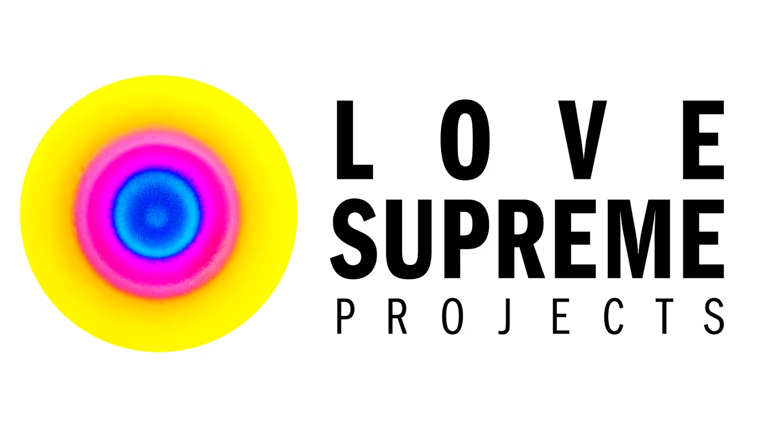
So where did the idea of the ink explosions come from?
Marina explained that the word yoga comes from yoke, meaning “to unite,” and that idea of union and centering became an early visual reference for the project.
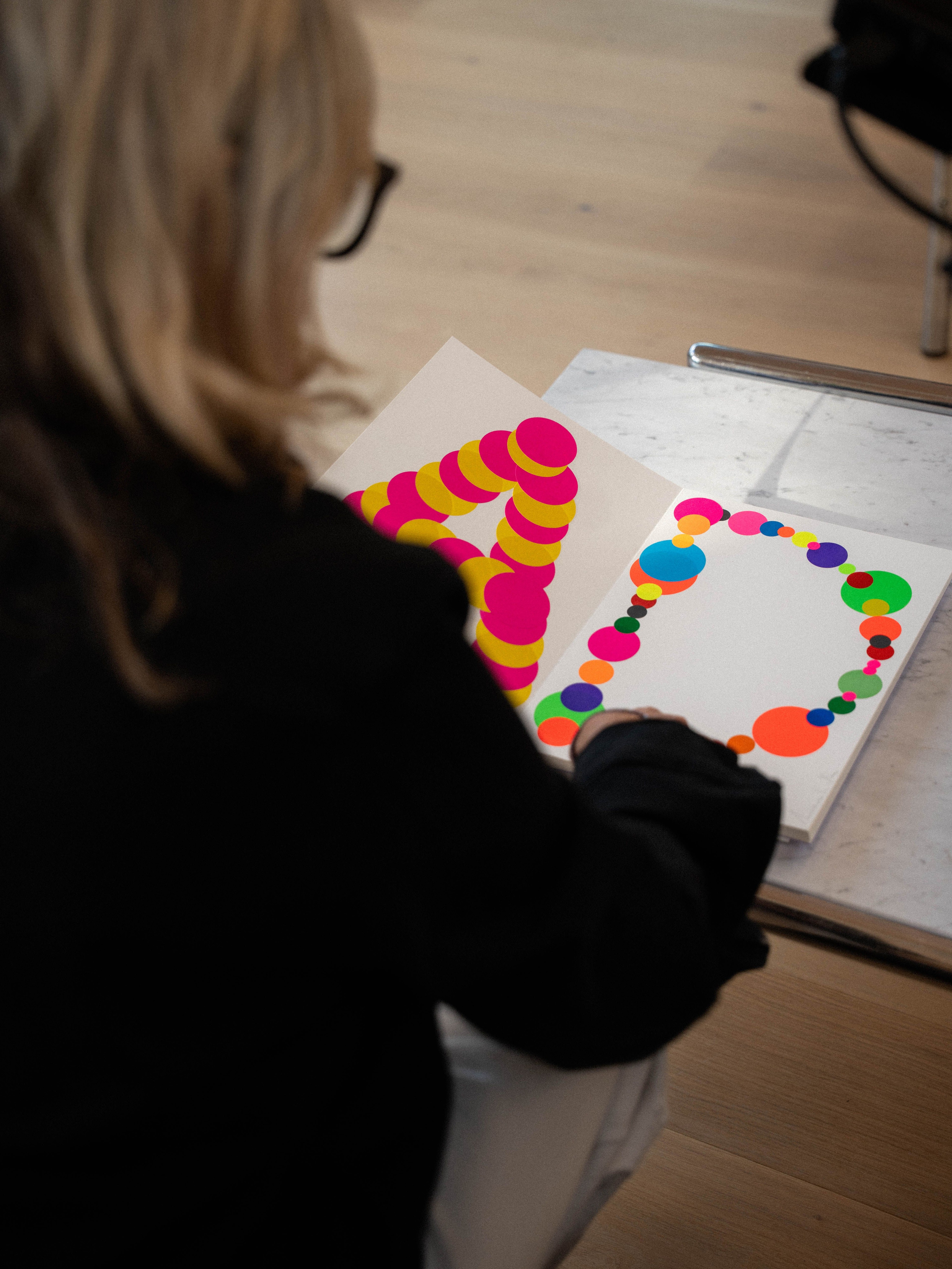
From that point, the team aimed to create what she described as “an explosion of colourfulness and energy,” something that echoed the feeling of being centered and present, and how that presence can release a contagious energy.
“The brief to my team and to myself was: how can we use ink to create a sense of colour exploding from a centre point?” she said. They imagined a drop of ink releasing multiple colours at once, like a small cosmic explosion.
They experimented physically with ink and liquids to create the right reactions, developing a palette of colours chosen collectively. Marina said the result felt like an immediate expression of who Love Supreme is: not something strategised, but something directly translated from their essence.
Movement was equally important. They animated the explosions using photography and film, creating a dialogue between stillness and motion. “There is meaning in every decision we take,” she added. The brand’s visual language emerged from this combination: movement, colour, energy.
Even the typography carried intention. Defined by Marina as contemporary but not trendy, it subtly references jazz; specifically John Coltrane’s album covers, whose lettering served as inspiration. This connection felt especially fitting, she mentioned, because Love Supreme plays a lot of jazz during their sessions.
How did you make sure the system worked coherently across posters, digital, motion, merch… everything?
“When we are creating the brand, we think about all the applications it needs to come to life. So we are aware from the beginning that we need something that works really well with motion. We also have to film and print at a very large scale, almost as if you’re making something for the cinema, which means the resolution has to be extremely high.
By working this way, we already understand which kinds of backgrounds will work if we’re making a flag, or a poster, or even a simple social media post.
You don’t need to apply any effects. It’s just the application of one single idea, and then carrying that same vibrancy throughout all the designs we created for them.”
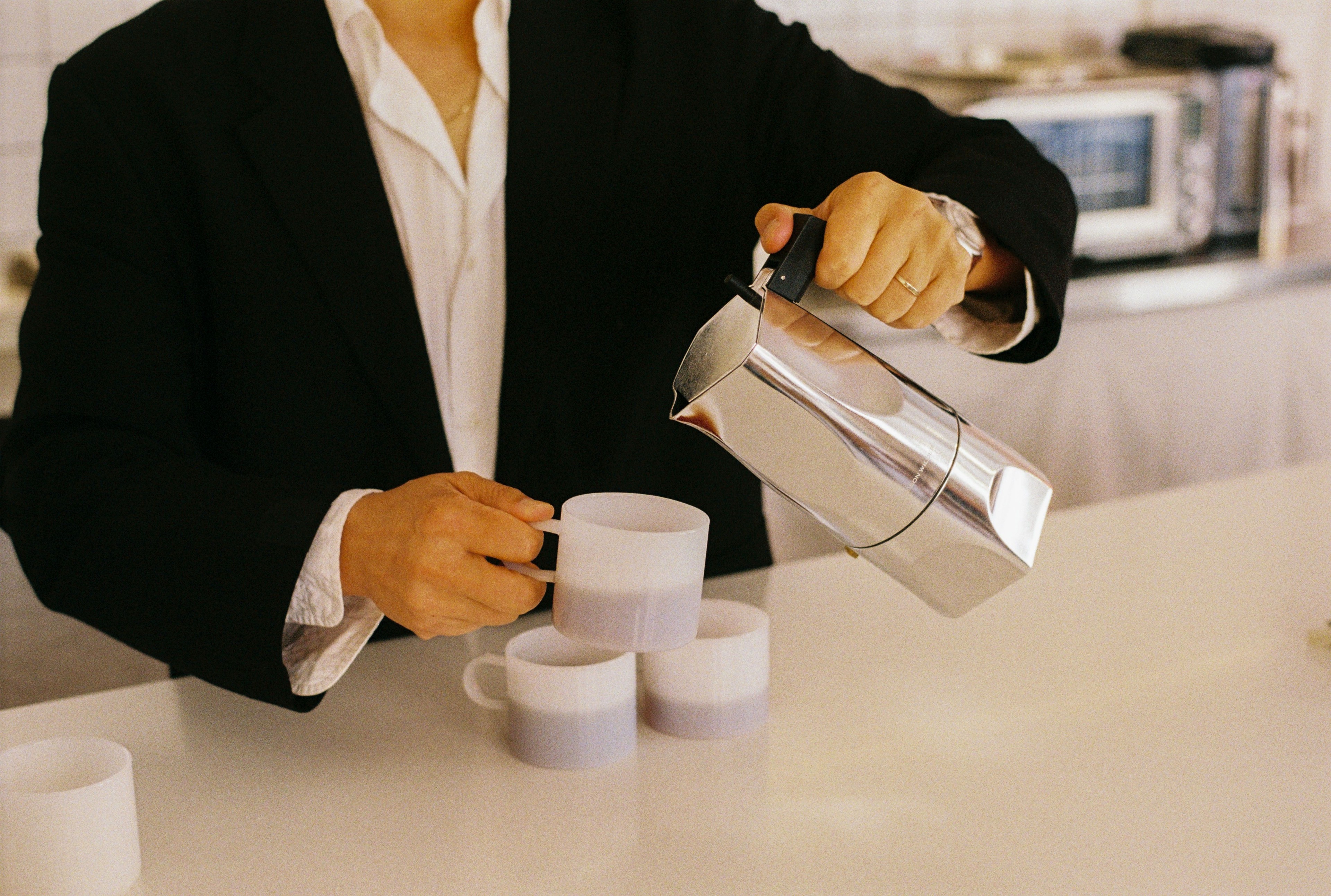
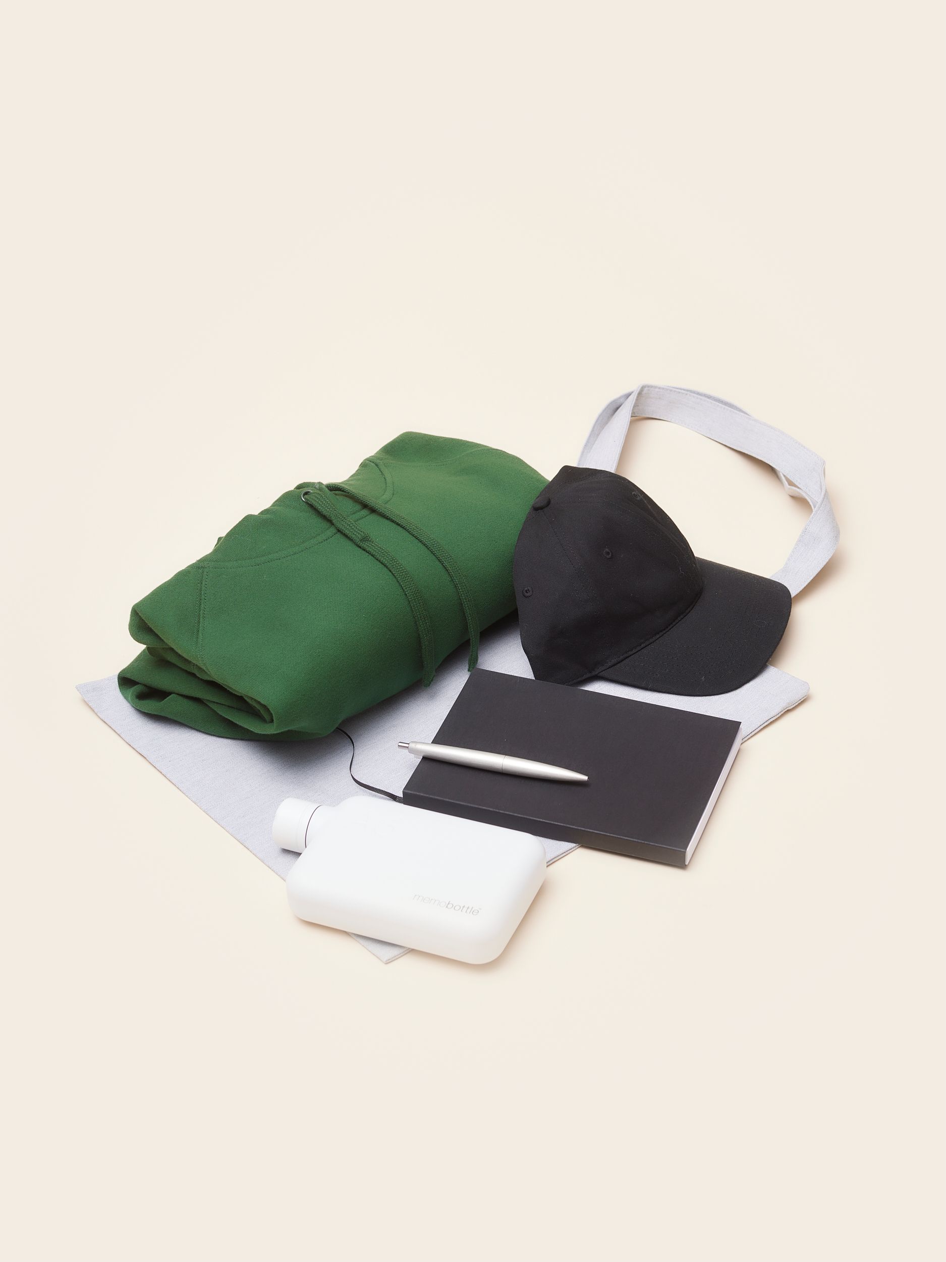
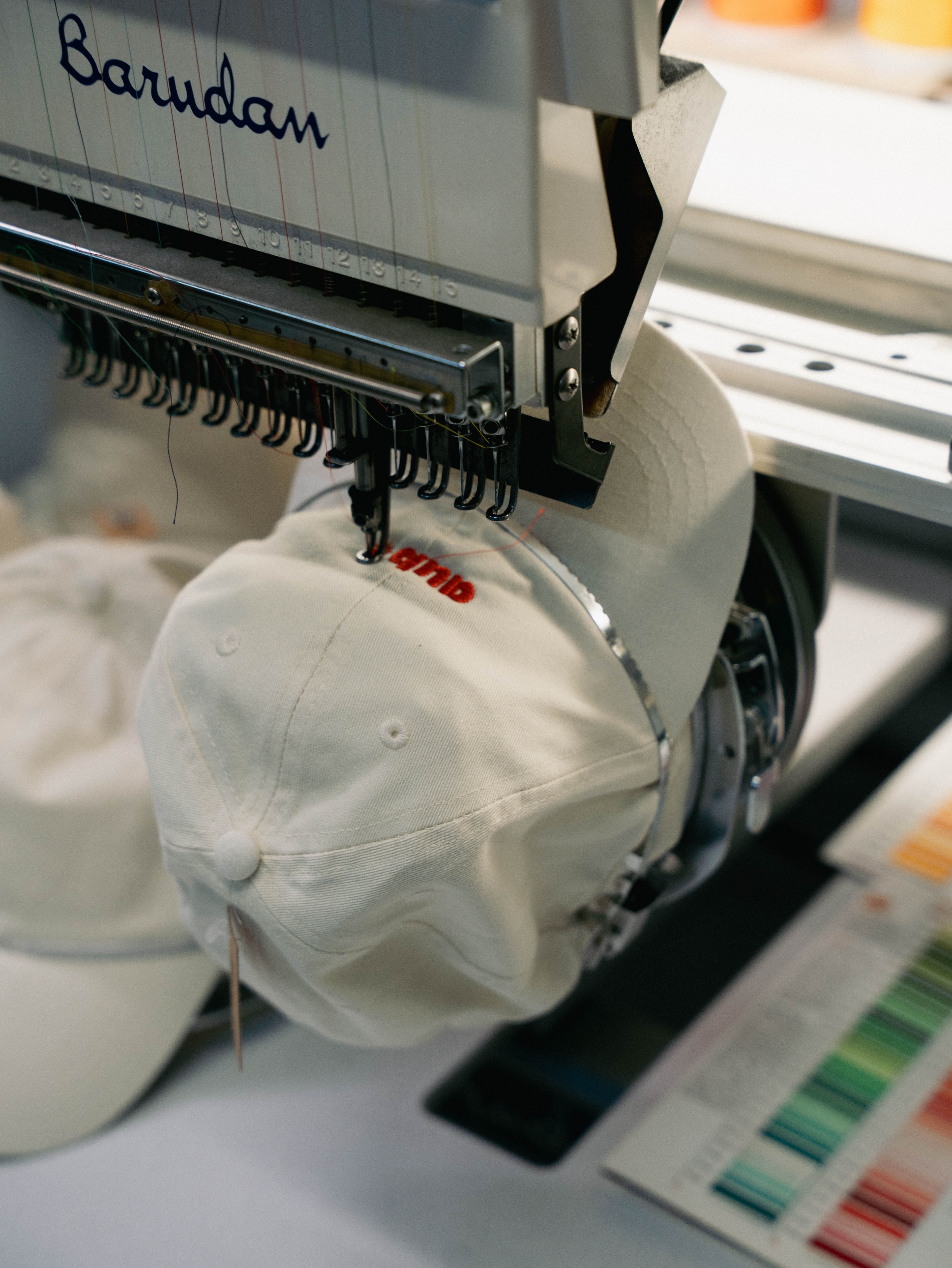
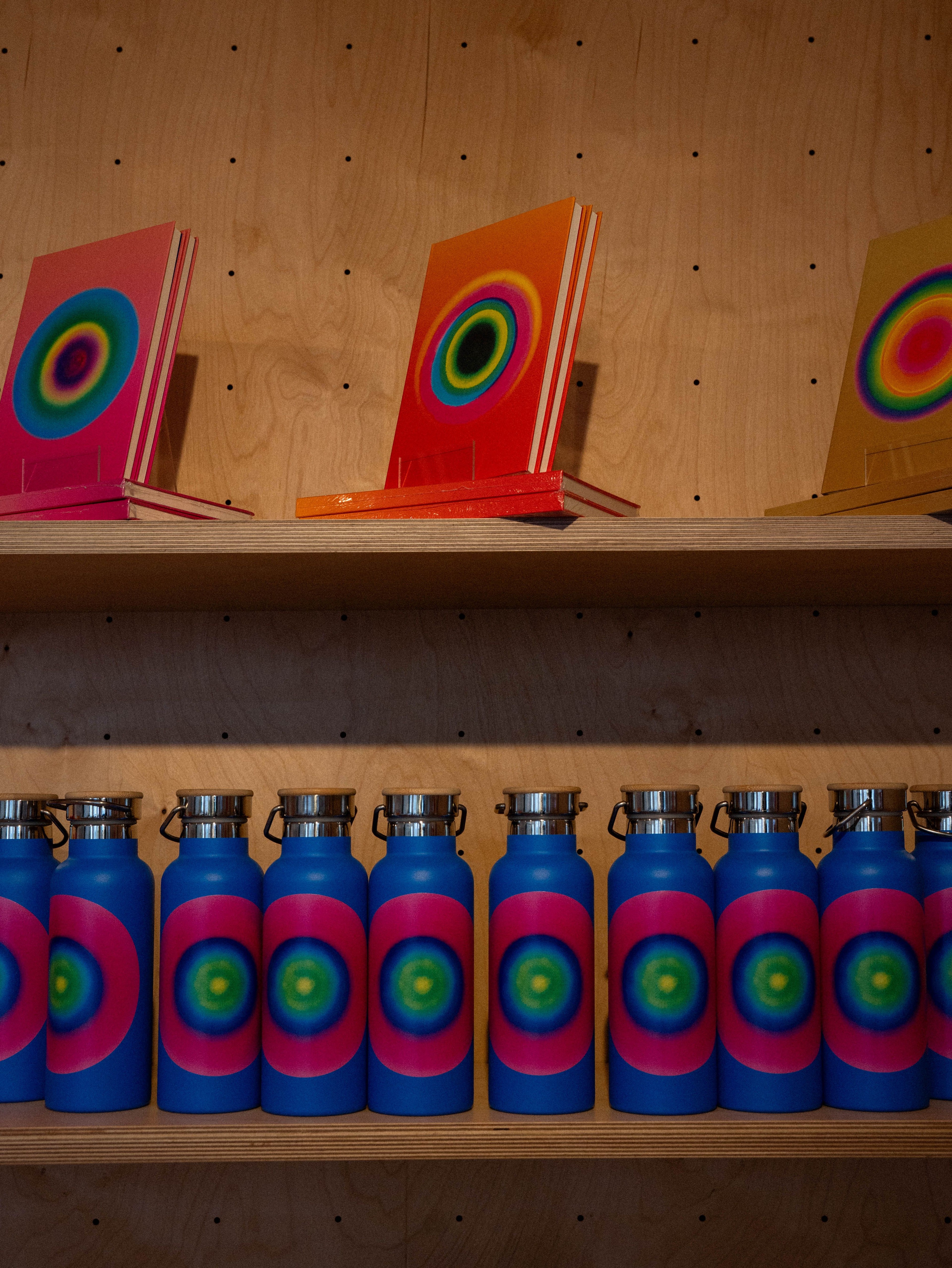
And what about the merch?
Marina explained that the brand needed to feel visually iconic not only because it had to express a powerful process that is this method of yoga and life awakening, but also because Love Supreme themselves are an extraordinary client.
“They’re so tasteful, inspiring, elegant,” she said, and the design had to reflect that level of sophistication.
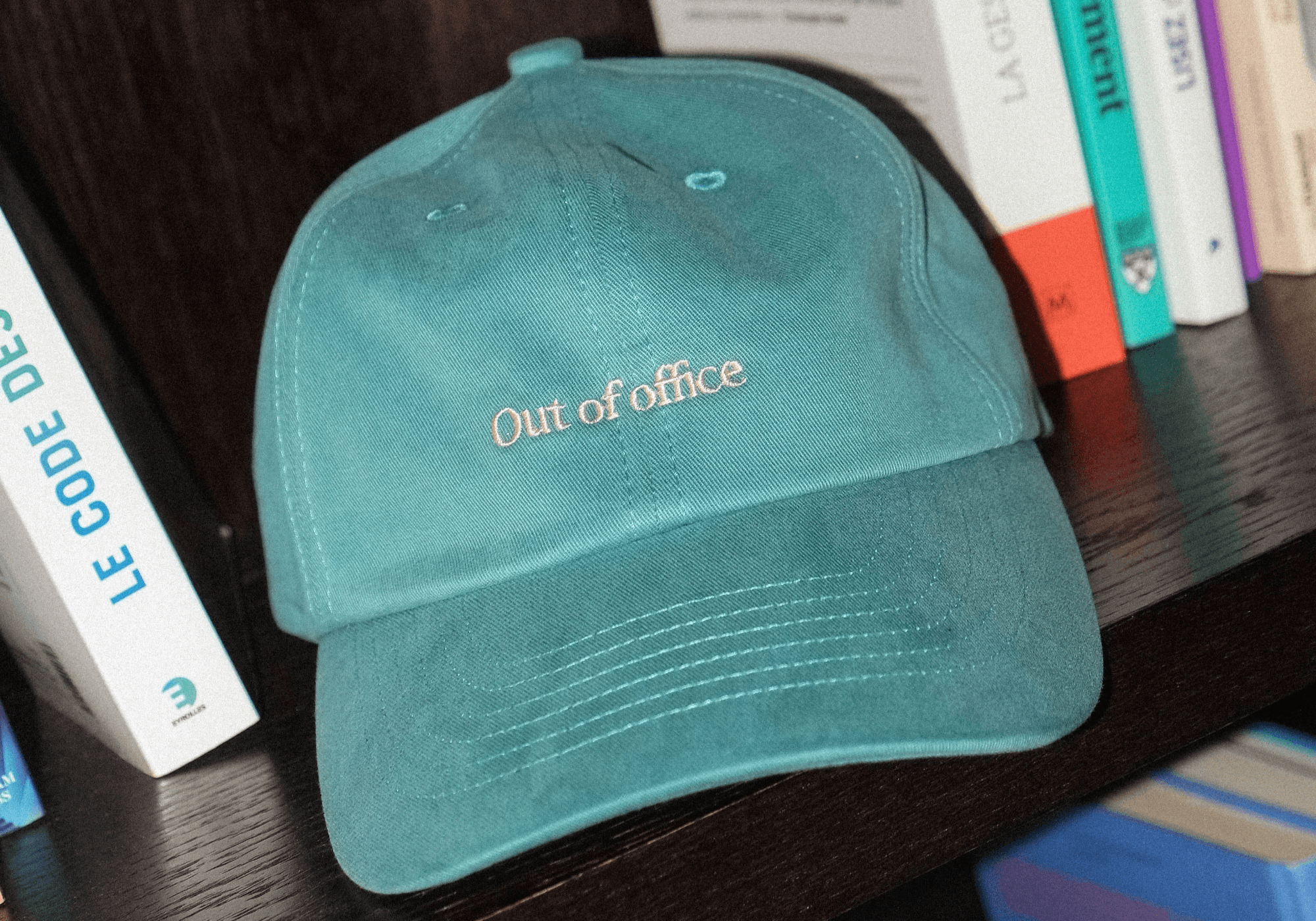
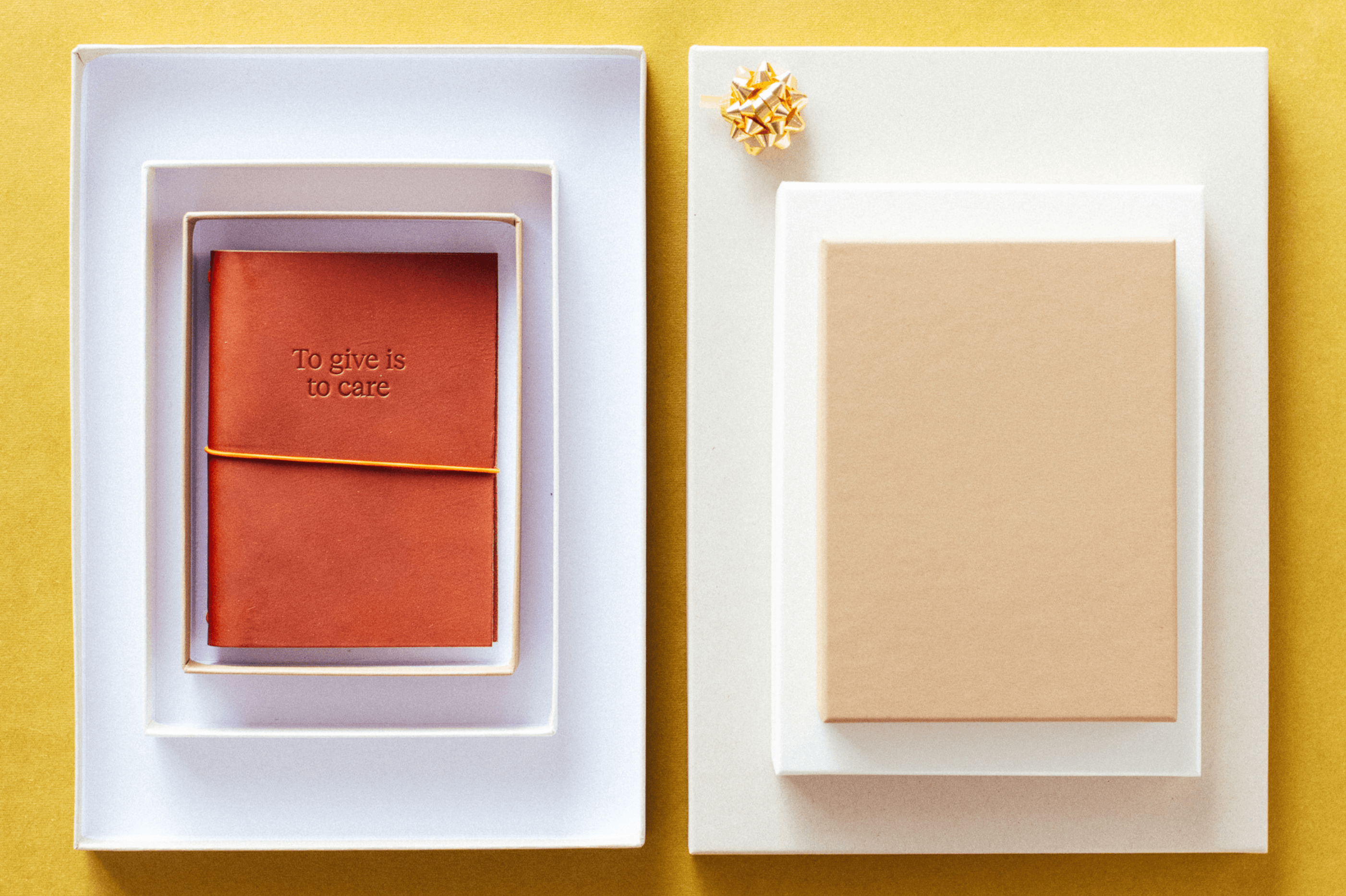
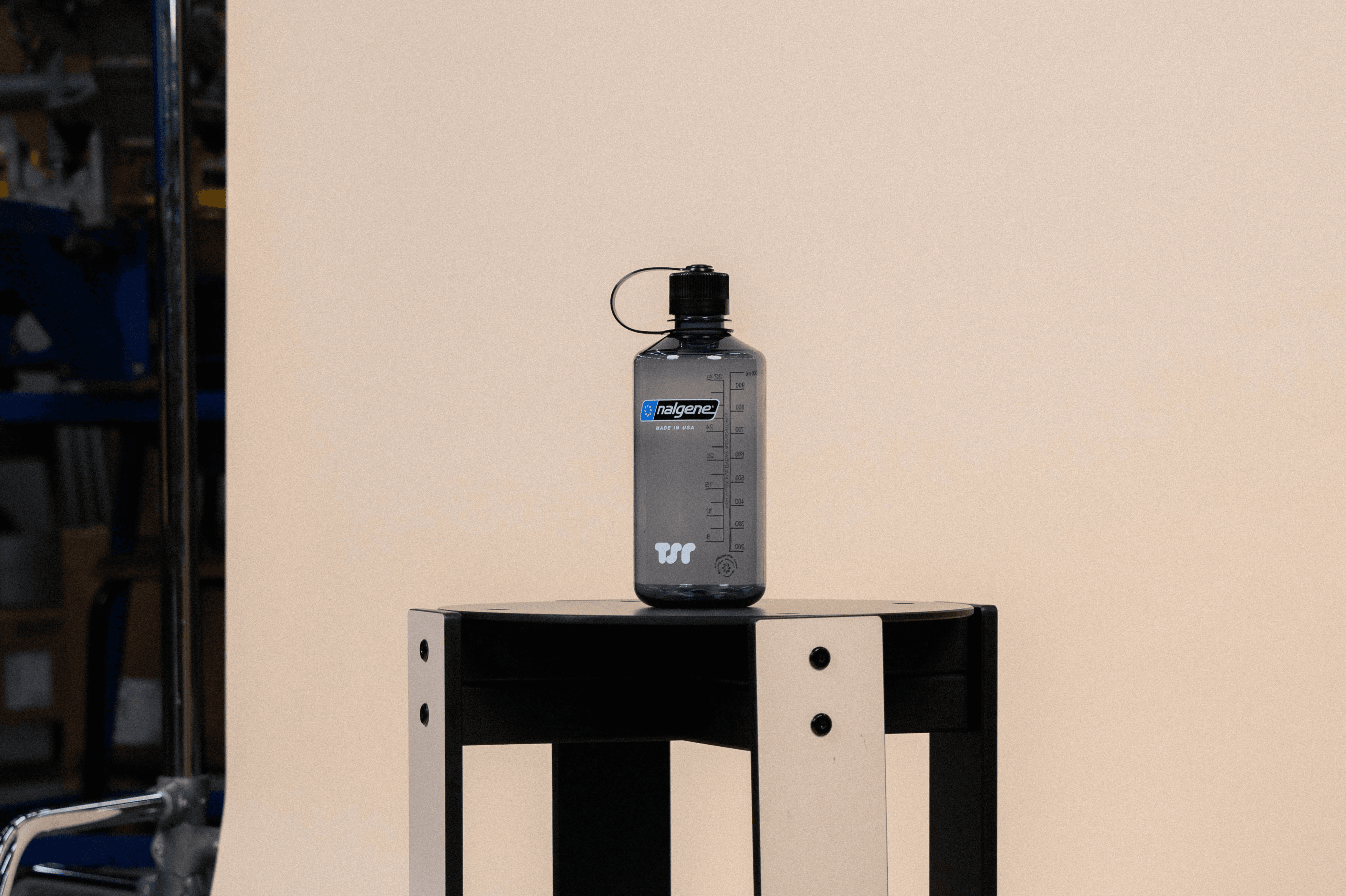
To translate into merchandise, the team creatde objects that were beautifully crafted and made to last. “The notebooks, the bottles, the postcards… everything had to be delicious,” she noted, not things bought casually, but items chosen with intention and kept for a long time.
She believes the brand helped Love Supreme become more visible, but always in a way that avoids feeling commercial. “It feels unique,” she said. And that uniqueness was essential to preserve the exclusivity of the project.
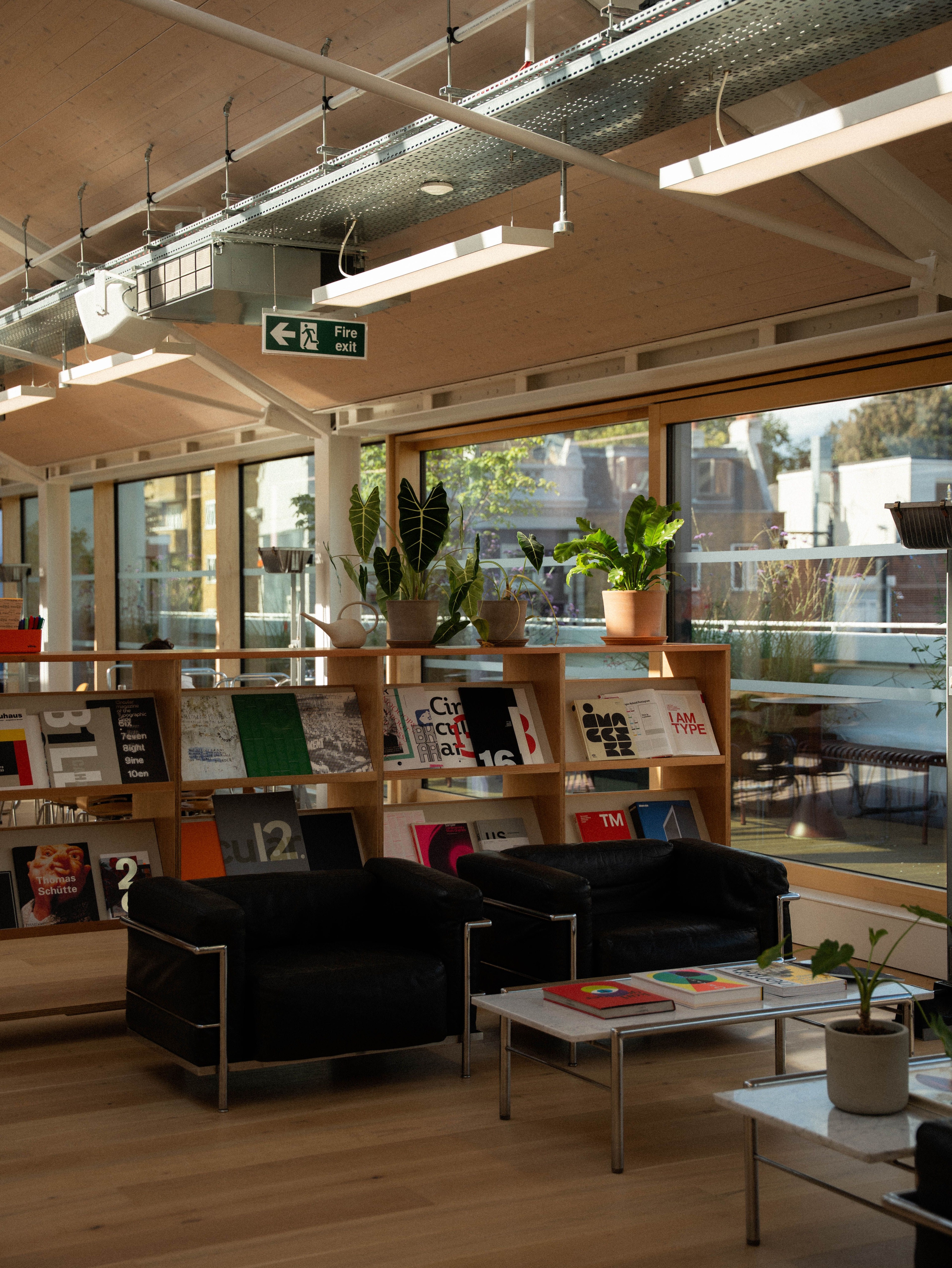
Your studio seems like a very creative environment. How does that influence your process?
“We just moved to a new studio, and we have a lovely workshop there. We create things in the workshop; all the experiments happen there. We really try to inspire creativity through the space itself. It’s a place for people to experiment, write down ideas, and test them.
There are lots of books, a library filled not just with design books but also art, culture, architecture: everything that inspires us. We also publish books ourselves, together with design magazines and our partners.
For me, it’s really key that we create a space that encourages creativity, rather than a factory-like environment with people sitting behind screens. An open, inspiring space benefits everyone.”
Where else do you find creativity?
“I find my creativity everywhere. As a child, I was always doing creative things: painting, making crazy constructions with kitchen objects… anything I could get my hands on. I really think creativity is a way of living, and you have to nurture it all the time.
Creativity is not a job, it’s a way of living.”